Comfortable, Practical and Luxurious
During the renovation processes the couple temporarily moved out of their home and into the neighbouring house, owned by Dan’s parents. “We were able to remain close to the site, allowing us to frequently check in on Oke’s progress,” Kim explains. “It is exciting to watch the space transform and to witness the design come to life.” The couple had a very distinct vision for their space and were eager to create a functional living area that was simple and practical while simultaneously evoking an air of luxury. The designs presented to them by Oke’s team truly embodied the couple’s goals for their space: clean lines, minimalistic design elements, and sleek fixtures.
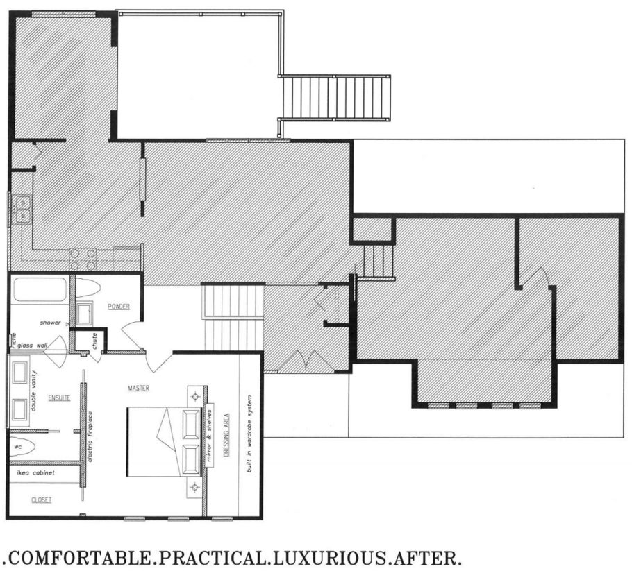
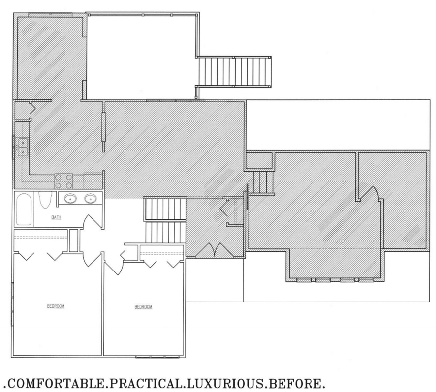
Although the couple was nervous about the limited square footage they had to work with, they were “floored” by the creative solutions Oke Woodsmith presented during the design process. “Every square inch of space was used, including behind the walls,” Kim excitedly explains. “But, what is even more impressive is that every bit is functional – each and every area has a purpose.” Prior to the renovation, bulky built in bookcases prohibited the couple from purchasing a king size bed, an upgrade they were quite eager to make. Additionally, storage space was extremely limited and the room severely lacked organic direction or “flow,” both of which are key to functionality and liveability. “The space felt cramped and restricted,” Kim describes. “Two words that should never be used to describe your bedroom – a room meant for relaxation and rejuvenation.”
Although the couple’s limited square footage presented a handful of obstacles during the renovation process, it became clear very quickly that Oke’s team would not let a single “hiccup” derail any of the plans they had for the space. “Any issue that we were faced with seemed to be waved away in an instant. They found a way to make everything work, even our fireplace which was the wrong size upon delivery. We couldn’t believe they managed to make it fit.” The serene modern fireplace was expertly recessed into the wall so as not to interfere with the glass pocket doors that frame it. The cool grey tone of the fireplace’s elegant face presents an interesting contrast to the light hardwood flooring that runs throughout the space. Dan and Kim’s selections from London’s Underfoot Flooring provide warmth to a space dominated by crisp white and grey tones. The couple’s large inviting bed, a stunning piece purchased from London’s Austin Taylor, works to ground the space, injecting a soft and comforting atmosphere into the room. Glossy white nightstands “custom made by Woodecor” nestle on either side of the bed while contemporary light fixtures dangle above, simultaneously cultivating character and providing functionality. These distressed iron fixtures represent a unique juxtaposition of contemporary and rustic design elements, featuring modern geometric orbs coupled with industrial inspired Edison light bulbs. Providing visual interest while remaining extremely practical, the fixtures do not take up any space on the couple’s nightstands, allowing Dan and Kim to eliminate clutter and maintain the décor style they sought to achieve.
This minimalist aesthetic is repeated in several other elements in the master suite, most namely the contemporary closet organization system (a glossy white Ikea PAX design), and the tranquil fixtures in the couple’s ensuite. Benjamin Moore’s “Edgecomb Grey,” an earthy, organic neutral with a modern edge, runs throughout the entirety of the space, creating a soft, stylish setting that feels distinctly personal. In the couple’s ensuite a retro minimalist vanity hovers above beautiful wide plank, pale grey tiles, evoking effortless style and tranquility. Light filters in from the long rectangular transom window that floats just above the large vanity mirror, bathing the room with warmth. To the right, a spacious walk-in shower and soaker tub enclosed by a frosted glass door contribute to the spa-like ambiance. In an effort to provide increased privacy and separation, Oke Woodsmith designed a small additional powder room, tucking it away behind one of the room’s sleek sliding pocket doors. “Our ensuite is undoubtedly our favourite element in the space,” Kim describes. “Oke’s team created an absolute sanctuary, one that everyone in the family wants to use. Our daughter cannot wait to use the shower every time she comes to visit. I can’t blame her, it really is wonderful.”
Dan and Kim’s fourth Oke Woodsmith renovation, like those that came before it, was extremely successful. Oke’s team worked diligently to ensure that all of the couple’s needs and desires were met, crafting ingenious solutions to any issue that threatened to hinder their plans. “As always, we are very happy with our finished space. It is everything we wanted: comfortable, practical, and luxurious. Oke’s team did an amazing job and we hope to work with them again in the future.”
- Floor Plan After Renovation
- Floor Plan Before Renovation


