Star of the Sea
A special home for art lovers
Smaller windows and more walls aren’t usual requests from a customer for Oke Woodsmith. However, homeowners Carla and Brian asked for space to display their art collection. Their sea-themed paintings also set the colour palette of blues with orange accents. The complementary hues reflect the couple’s interests. Brian
is a sailor and Carla loves a warm, welcoming entertaining space.
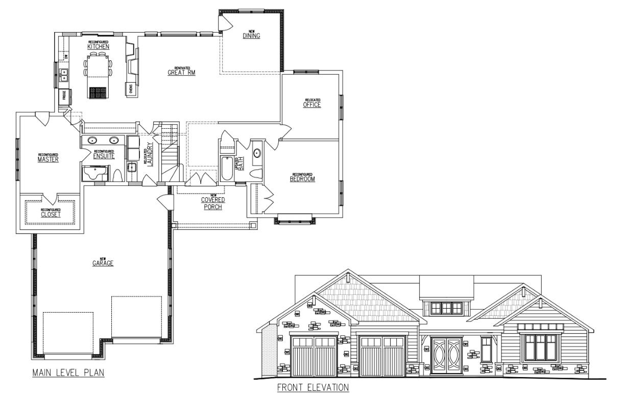
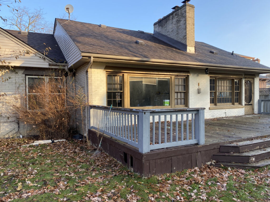
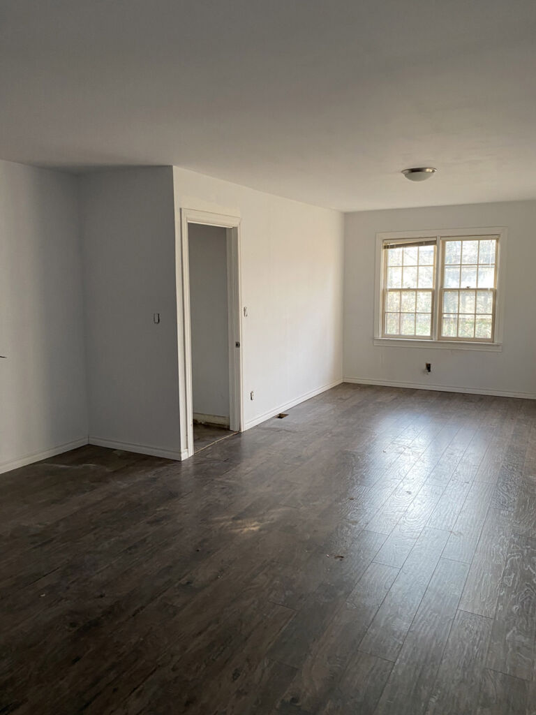
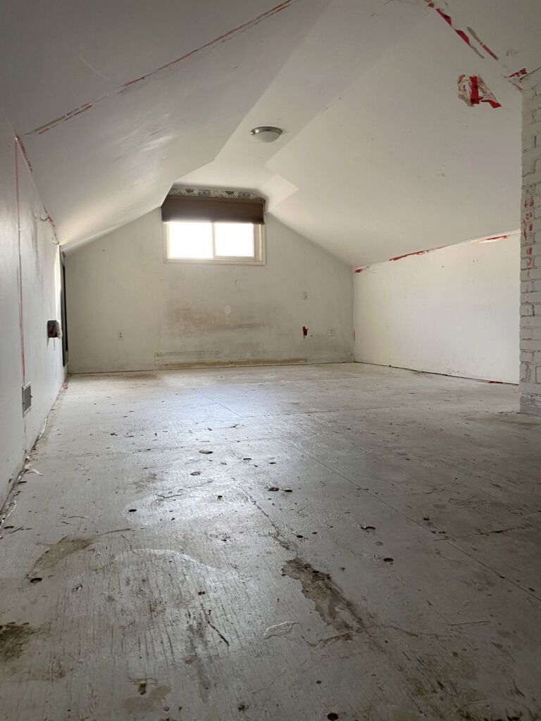
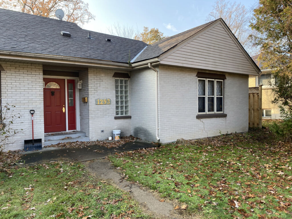
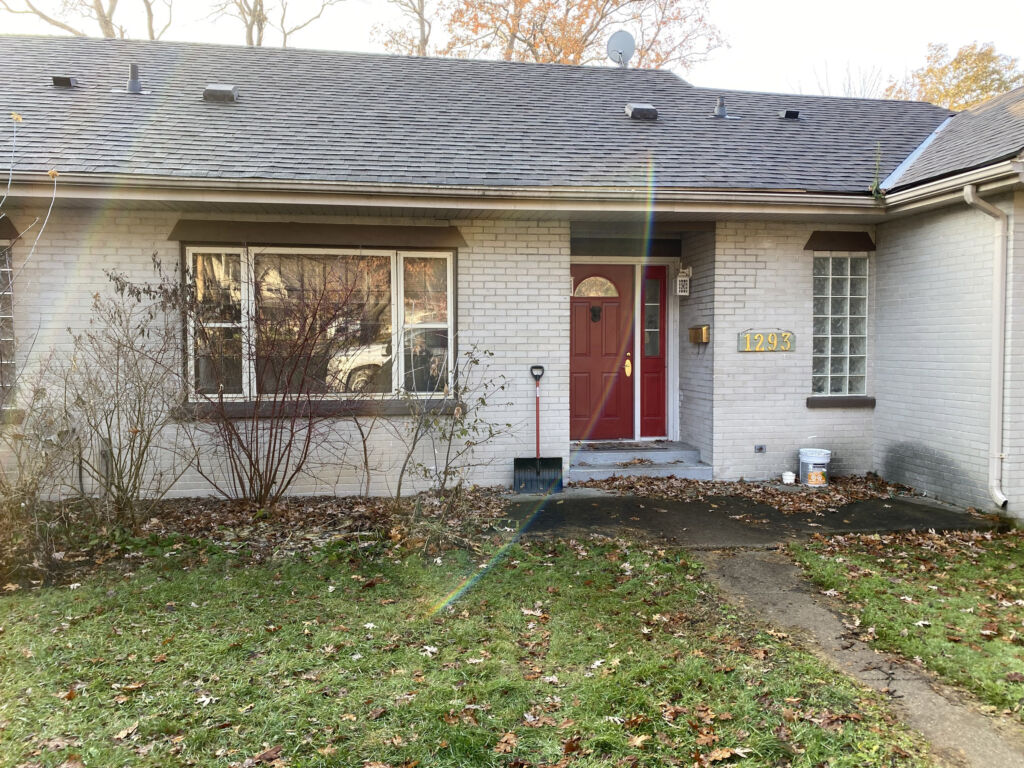
Their 2,500-square-foot home in Sarnia was given a major facelift to bring the mid-1950s building into the 21st century. Today, it includes two bedrooms, two and a half baths, den, a flex space loft, kitchen and great room.
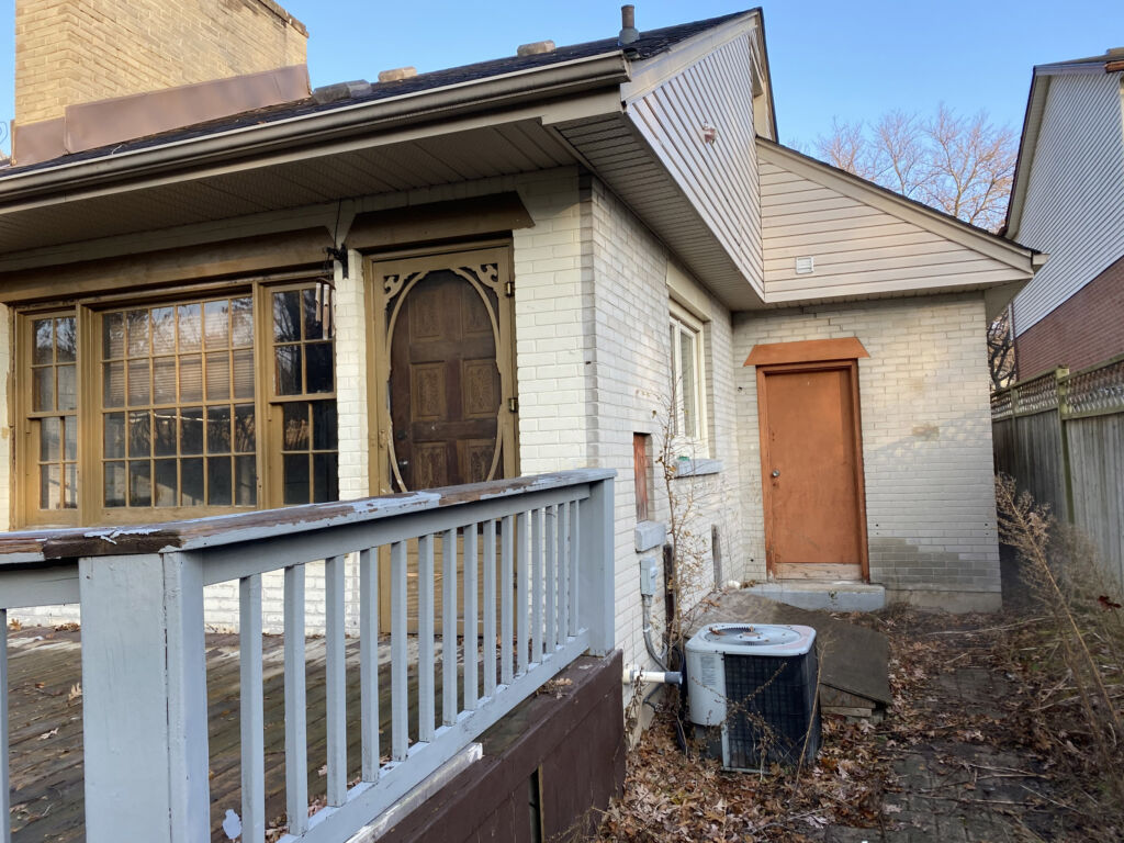
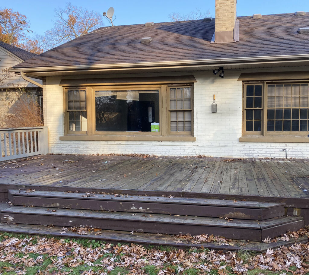
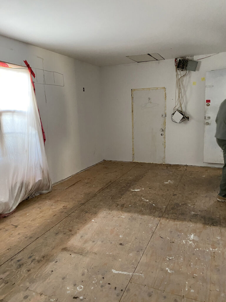
“It’s a small footprint that lives big,” says Randy Oke. It had been a rental property and was in rough shape.
“Carla had a pretty good idea of what she wanted. She was a big part of it,” says Steve Poortinga. “The original
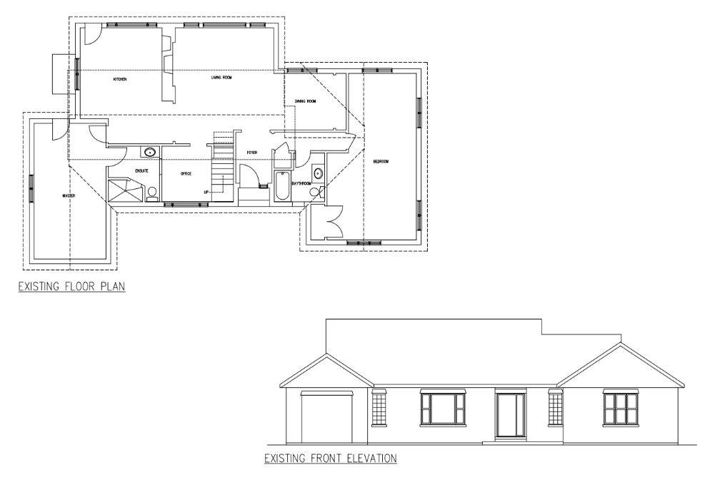
design was flipped. We put in for the permit and had to alter the plans. The flow turned out even better and the curb appeal improved.”
The need to change the design came after the couple had traveled to Florida for the winter. So, Randy and Steve came up with a solution, then contacted them. “We know how to go with a curve ball thrown at us,”
says Randy.
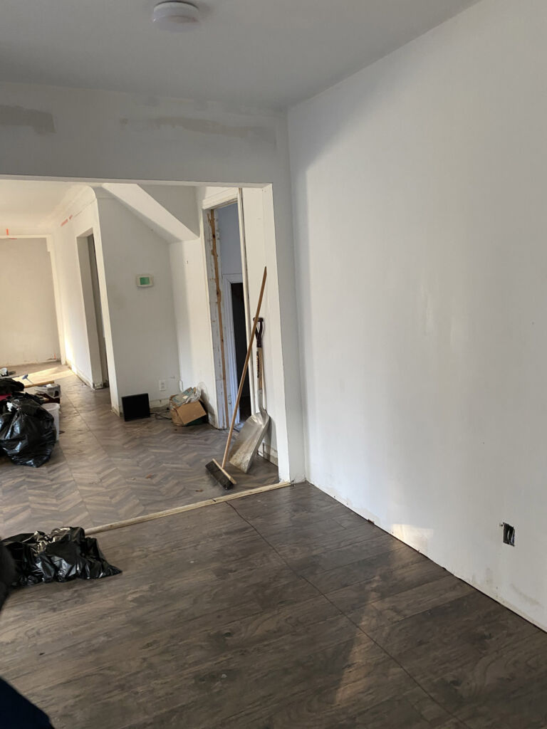
To address the permit requirements and Brian’s large dining table, Steve flipped the layout, adding an extension to the back and a garage at the front. The bump-out was the best solution to seat 12 at the table and it created a long gallery-style wall for art. “We’re used to nine-foot and vaulted ceilings,” says Randy. “These are eight-foot
ceilings. So, we did a reverse tray over the kitchen island to make the room look taller and more spacious.”
The next curveball was from Carla and Brian – fewer windows, more walls. “At Oke Woodsmith we tend to maximize out the glass area,” says Steve. “You give me a wall, and I’m going to put a window in it. Carla said, no window, too big. Once I saw their art collection I understood. They needed more wall space than window space. That was different for us. Usually, we do not have clients say make the windows smaller.”
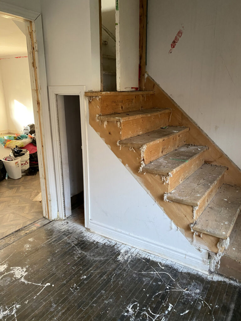
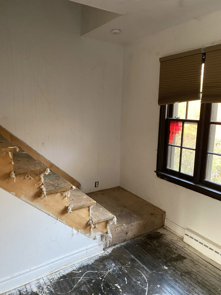
The entry was also altered to showcase art. Normally Oke Woodsmith builds a railing at the top of an open staircase. Carla wanted it closed in. Steve designed a display niche, widened the stairs and added pot lights to spotlight the art. Poplar stair risers and treads were stained to match the luxury vinyl plank flooring from Hucker Floor Covering in Sarnia. Ceramic tile makes the entry easy to maintain. Brian chose a dramatic front door that he’d had in a previous home built by Oke Woodsmith. “It added to the grand feeling of the foyer,” says Steve.
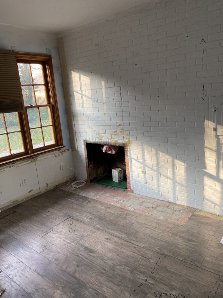
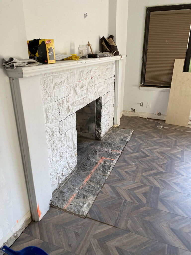
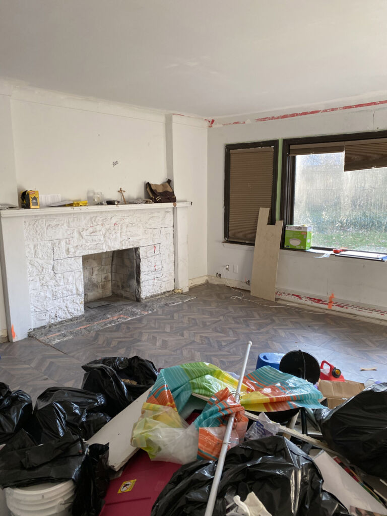
A fireplace in the centre of the house was removed, adding space and eliminating the leaky chimney. Steve used the new-found area for a 4×10-foot kitchen island that became the focal point. It contains the gas cooktop and seating for six and is topped by a slab of onyx, a type of translucent marble. A separate bar area includes wine storage and fridge. The maple cabinetry was installed by Woodecor. A new fireplace in the great room was faced in granite tiles.
The main bedroom is located where the former garage sat. It’s one step down and includes an ensuite and large walk-in closet.
Brian found the glass door for the guest bathroom and Oke Woodsmith installed it, creating a custom look for a fraction of the cost. A second bedroom and den/office replaced two former bedrooms. The bedroom window seat provides a perfect spot to read and adds interest to the exterior.
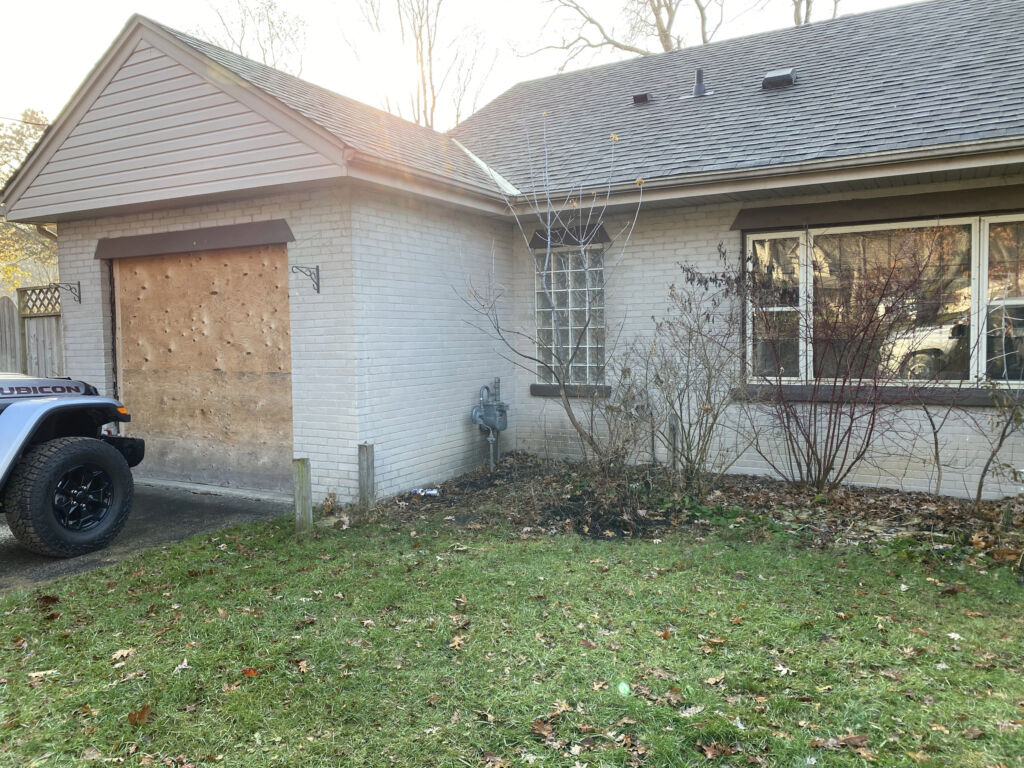
“One of the biggest transformations was the curb appeal,” says Steve. “It’s in a very nice neighbourhood.
It didn’t really fit in before. Back in the day it suited the streetscape but over the years it had fallen behind.”
The new two-car garage features a Permacon stone façade. Existing brick was painted to match new vinyl siding.
“We find we learn a lot from our clients,” says Randy. “They bring finishes for consideration, and we incorporate them in their home or cottage. With these new-found ideas, we sometimes incorporate them into another project. These are often things they’ve seen on Pinterest or Houzz that they share with us. It gives us a sense of their likes and dislikes.”
The homeowners were unavailable at time of writing, so they asked Randy Oke and Steve Poortinga to share the story of their renovation.


